Look, I hate AI slop as much as the next person. My kiddo has been taking a college class where they’ve been delving to the ideas swirling around AI/LLM’s and from what I gather, the class is nearly incomprehensible. Just like my toaster, oven, toaster oven, fridge, and dryer don’t need wifi – neither does every damn thing need a thick coating of AI slop all over it.

I’ve been thinking about AI as a variation on the “super soldier serum” administered to Steve Rogers. Given to a good man, he can be better. Given to the Red Skull, well, he gets worse. Instead of only making things better, it seems to simply magnify the attributes of a thing.
I guess I’m struggling with the idea of whether it’s hypocritical of me to use AI for things when so often it just makes things worse. 1 And, I admit it is fairly self-serving to liken my uses to that of Steve Rogers and assign derogatory attributes to other uses.
Maybe it’s that I’m using AI/LLM’s to add micro improvements to my own life, rather than pushing it on others? After trying to work with free AI’s on some projects, I decided to pay $20 for a month of premium Claude Pro access. While using the free ones, I discovered:
- Claude’s free chat would lock a conversation after a certain context length if you uploaded any documents
- Gemini would time-gate a conversation by not letting you use it after a certain amount in a given period
- ChatGPT would time-gate a conversation if you uploaded anything, but would merely drop to a lower power model if you didn’t upload content and instead just worked through the chat interface
Overall, ChatGPT was more useful as long as I didn’t upload anything, and I could “make do” with the lower tier models. I’d paid for the premium tier of ChatGPT for a few months about two years ago and quickly became disillusioned with it. I found that it would start to chase it’s own tail, forgetting the thread of a conversation and project, randomly refactoring stable code, hallucinating functions, variables, and the names of functions and variables. It was more work to keep it on the rails than it was to simply just work on my project. I ended up largely shelving several projects as a result. I’d tried unsuccessfully to hire someone, I didn’t have the time to work on them by myself, and sure as hell didn’t have the bandwidth to baby sit2 an LLM.
However, working with various LLMs recently gave me a glimmer of hope. Perhaps they could be useful after all? Pouring over documentation, searching for answers, and consulting Reddit and StackOverflow were options, but they all had their special problems. In any case, these days all of these options (except documentation)3 were getting more difficult to use as people started abandoning public forums in favor of just asking an AI.
So, what have I been working on? Well, I signed up for Claude Pro on 02/09/2026 and in the just over three weeks since then:
- WordPress Plugin.
- An overhaul of a website’s registration system. I had been using a now-defunct WordPress plugin on a different website which was basically crumbling to pieces as WordPress and the world moved on. My needs were simple – so a few days of tinkering with Claude Pro got me something that … just worked for my purposes. It eliminated all spam robot signups in a way that nothing I’d tried before had been able to manage. There were a lot of moving pieces to this plugin, and there was certainly some growing pains, but it worked very well, very quickly. I have built plugins for WordPress before and could well do so again even without an AI, but the speed of the model to build all the trivial or tedious stuff is by definition super-human. Since the site’s ability to turn visitors into users into (hopefully) a few dollars is dependent upon the ease of registering, this one single change easily justified the $20 cost of using Pro. That $20 accelerated this from a project I’ve been putting off for literal years because I knew how long it would take me alone, to … solved in a few days.
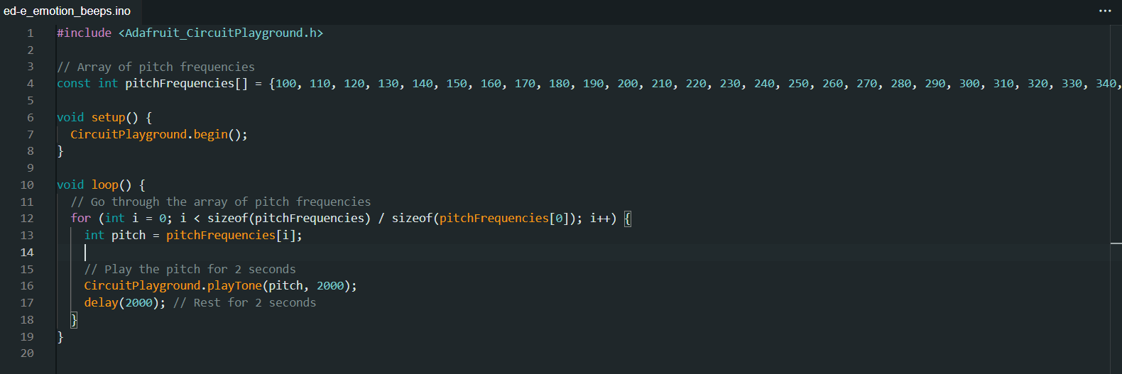
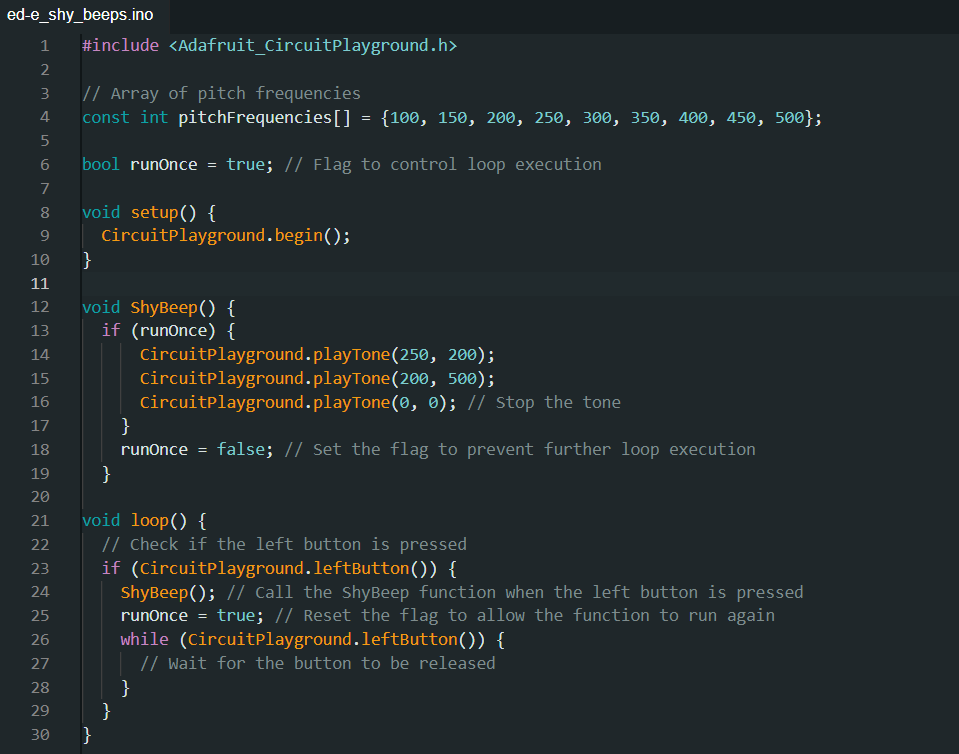
- Python Assistant Script.
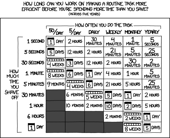
- As a friend was quick to remind me, I’m very late to the voice activated computer assistant / smart home party. I’d been working on a version of this with three free frontier LLM models, but it was too much, spread across too many platforms to be really cohesive or stay undamaged by converting parts among through these resources. Progress on this project has been slower than building a single WordPress plugin, but it has definitely been boosted. I regularly have to join online meetings where the information to join is sprinkled like breadcrumbs across multiple disparate pages on a given website, sometimes requiring a pseudo-registration process to reach. Doing all these things manually is a real headache when I haven’t had my morning coffee. And, let’s be honest, it’s way more fun to throw hours at a problem figuring out how to solve a problem than it is to actually face one’s problems. I would estimate that this feature will save me about 15 minutes once a week. Using the above XKCD logic, I’m time/energy/effort-positive if I could built this feature in less than 5 days. I probably got it working in a few hours. At the same time, I’ve been “bolting on” new features – a scheduler, time queries, weather queries, media control over my computer, with more features on the way.4
- A YouTube Management Chrome Plugin.
- I have this unfortunate habit of keeping too many tabs open. While this is bad enough, keeping a lot of YouTube tabs open will have a huge impact on system memory very quickly. I didn’t have the time at the moment to watch the videos, didn’t want to lose these videos, and didn’t want to go through the hassle of adding them to playlists. Instead, apparently I had enough time to build a Chrome plugin that would go through all of my tabs, bookmark each one to a special bookmark sub-folder, sort them into sub-folders, and then close those tabs. I don’t know that this will ever “save” me time, but it certainly is helping my system work better and keep my tab monster from getting too far out of control. However, I think I’m going to extend this plugin to be a little more practical. I think it could work for more than just YouTube videos to mass-close tabs, bookmarking them so they’re not lost, then sorting them into sub-folders.
- Email Entries for Work.
- My day job requires entry of data into a web portal. It’s a good content management system, but not great for data entry. It’s designed for humans to insert data, slowly, one entry at a time. The UI requires a couple of duplicate keystrokes and/or mouse clicks. While I deeply dislike having to do something stupid even once. I absolutely loathe having to do something stupid twice. It’s basically my kryptonite. Rather than enter emails into this system, which I fucking hate, I wrote a Python script to pull data from Outlook into a CSV, export the email data into an HTML file which reviews each email and suggests an entry code for each one, and once that data’s been cleaned/formatted, which I upload into a script that I wrote to work with my employer’s website, then begin the process of uploading each one. Since the data entry website has all kinds of dynamic elements and animated features, I can’t simply populate fields – I have to give each one time to load. Instead of just uploading an Excel/CSV sheet, I have to wait for each entry to play it’s little animations, time the data to populate, and then click each one manually to enter because the animations sometimes don’t work well. However, it’s a million times less painful than having to type all this bullshit in myself.
- Don’t worry, I don’t upload any of my email or data into any LLM. All the logic which pulls data out of my Outlook and builds things out of it runs on my local machine.
I never could have built so much, so fast, without the help of a frontier AI. None of the local LLM’s I’ve tried got even close and none of the free-level AI’s could maintain coherence long enough to help.
Claude Pro isn’t without it’s problems – I still had to monitor the code closely, keep it from forgetting certain key features, and deciding to completely refactor the code. At the $20 level, I can choose among several different models that are supposedly different levels of quality and consume higher amounts of tokens, and I’m limited to a certain amount of compute within a 4 hour window and limited to a certain amount each week. Even so, I’ve had more than enough compute for the tasks I’ve been doing. While these things have been super helpful to me… none of them are cutting edge research or huge trade secrets. In the chat interface you can switch language models, but doing so requires your conversation restart in a new conversation entirely. In Claude Code you can switch the models, but I feel like the LLM lost the thread a little when I did this.
I am a frugal man and tried to do this with free LLM access, but the benefit of more capable, more coherent models, with increased ability to share an entire code base (with the help of Claude Code + Github) for $20 has been an unbeatable deal. I’ve got a few ideas for some additional projects that could benefit from keeping the subscription going and will probably give it another month. I don’t know that I’d need year-round access though.
Software Development with LLMs- Series Plugin Test for Illustrative Purposes Only
- ChatGPT WordPress Plugins
- Coding with an LLM Sidekick
- Python Practice with an LLM
- Not Team AI
- Never Stop Breaking Up
- Weakness
- “Do I contradict myself? Very well then I contradict myself, I am large, I contain multitudes.” – Walt Whitman [↩]
- And, let’s be real – train [↩]
- RTFM, I guess [↩]
- Screenshots, giving me a daily briefing, etc [↩]